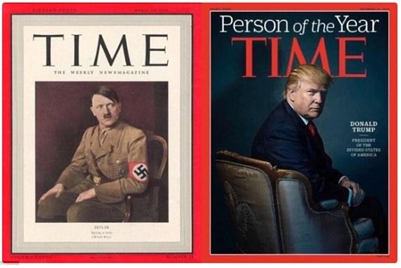
Is it a staple template from the Time Magazine brand? Is it designed to proliferate a certain tone? It’s interesting to find the striking similarities (read: consistency, the hallmark of iconic brands) between these two covers.
Two cult figures, similar posture, ominous shadow with the color of the backdrop complimenting the suit, turned head, folded hand, sitting on a chair, looking over shoulder, similar placement of head in the layout and devilish horn in the form of M above them. These are just too much to be a coincidence. As the last ‘M’ part became subject to intense scrutiny, analysis, wisecracks, and memes, Time magazine editors felt compelled to publish this clarification, “Any resemblance to cats, bats or devil horns is entirely coincidental.”
But when you place Hitler and Trump alongside each other, it made them appear as if they were back-to-back. Eerily homogeneous. Nothing political as it may seem, in naming “Person of the Year,” Time doesn’t endeavor to select the best person of the year, but the person “deemed to have most influenced the year’s news, for better or worse.” I am only surprised by the cult level consistency between 1938 and 2016. You won’t find a hint of it in its editorial guideline.

